Logos
Logos
The ANKER wordmark is an important expression of our brand identity. By applying the wordmark in a consistent manner, it strengthens the recognition & visibility of our brand.
The logo
Logo and the new ANKER RED.
Unmistakable and clear in perception. A colour statement that attracts attention and offers quick and clear identification across all media.
While the imagery is already paying into an initial unveiling of the brand, the new ANKER RED gives the viewer explicit and quick confirmation and leaves no doubt about the sender.
Logo clear space
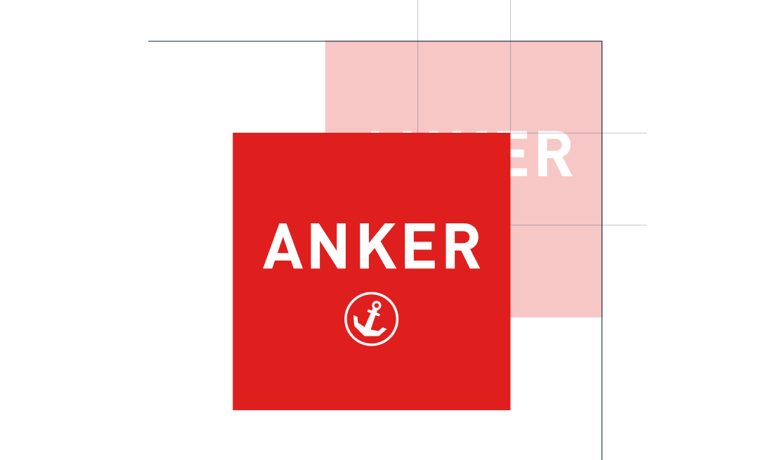
The distance to be maintained from the edges is one third of the ANKER logo. Exceptions can be made due to limited space on digital devices, e.g. websites, social media posts, etc. The logo must always be opaque.
- Do NOT use background colors that blend into the logo.
- Do NOT use photography that blend into the logo.
- Do NOT use the logo in the middle of a sentence.
- Do NOT alter the orientation of the logo.
- Do NOT distort or alter the logo.
Logo measurements
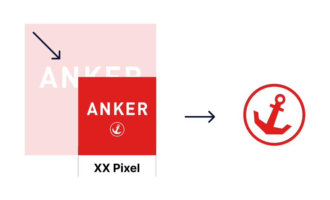
Example sizes, minimum size is … After that, use Symbol.
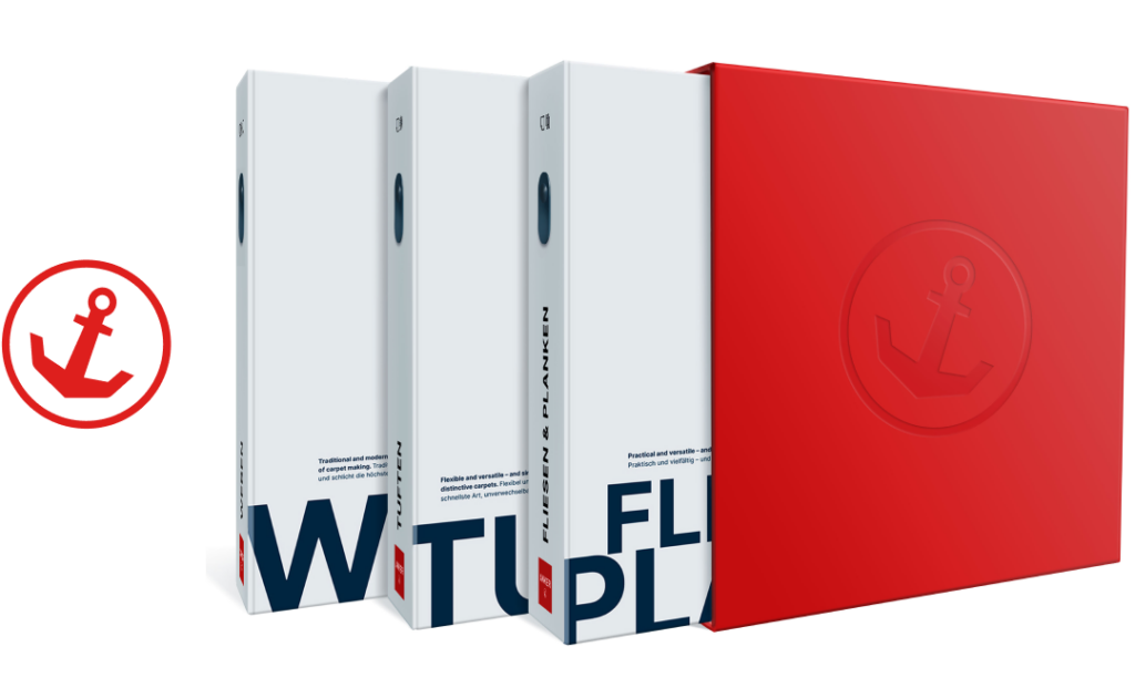
The anchor symbol
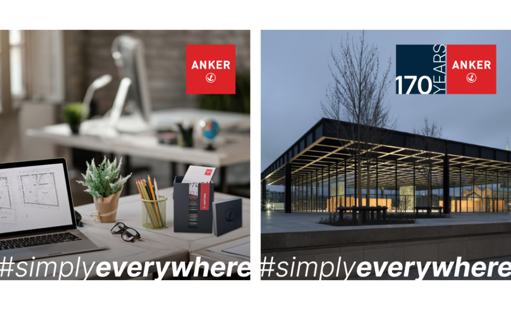
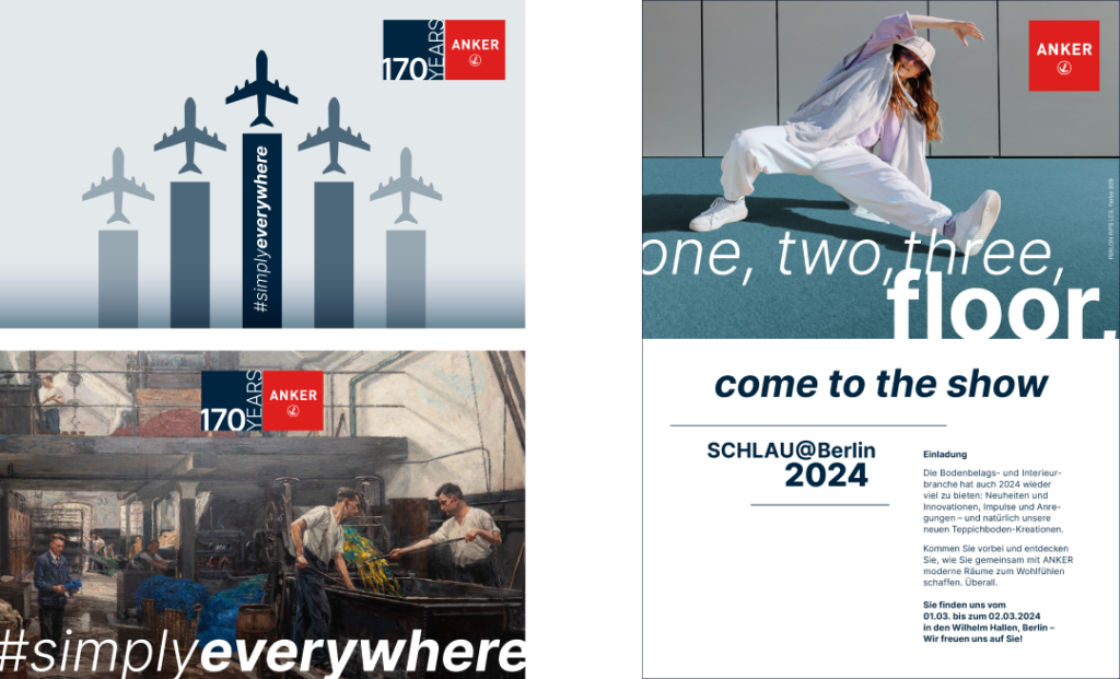
170 YEARS
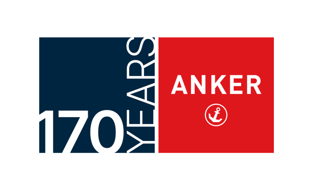
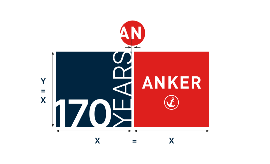
Proportionate dimensions:
- The 170-year-signé consists of the 170-years-block and the ANKER logo.
- The 170-years-block may not be used separately.
- The sizes of the two elements are always identical.
- The distance between the squares is determined by the stroke width of the letter „N“ in the logo.
Logo best practices