Typography
Typography
The font is as multifaceted and colorful as life itself. It communicates not only through the written word, but also through its appearance. Loud, quiet, large, small, important, unimportant, horizontal, humorous, cool, ...
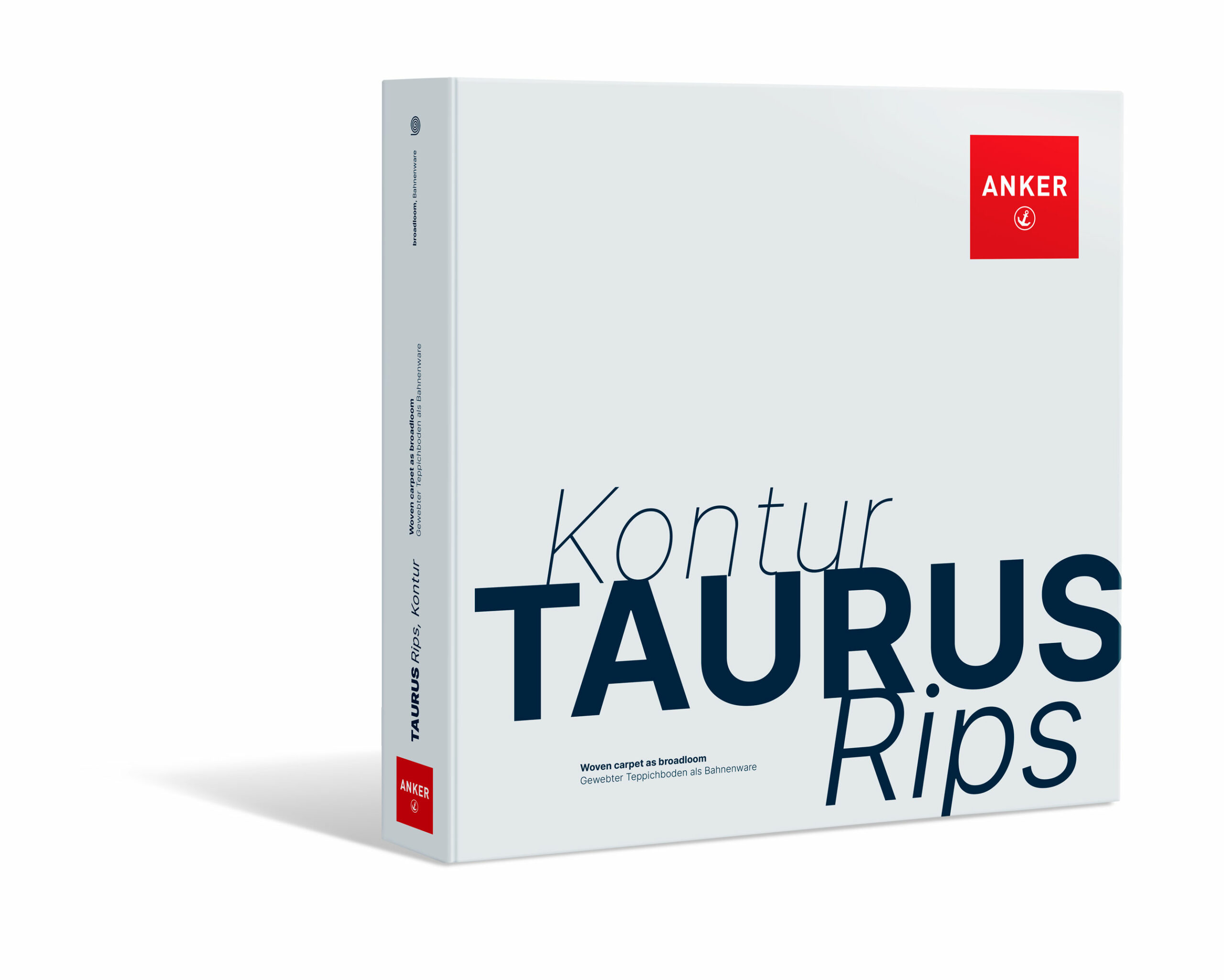
The ANKER font is 'Inter'

The ‚Inter‚ font is a sans serif font family that was originally developed for computer screens. It has a high x-height to facilitate the legibility of texts in mixed upper and lower case.
The font family has 18 weights, 2,500 glyphs and is therefore extremely versatile. This is also utilized and exploited in the Corporte design.
How to use
The use and style of the font ‚Inter‘ in relation to ANKER’s corporate design is inspired by graphic designer David Carson.
His principles are:
- Knowing your audience
- Get inspiration from your daily life (with ANKER)
- Emotional typography
- Visual Communication
- Break the rules, but still respect them
The use of 'BigTypo'
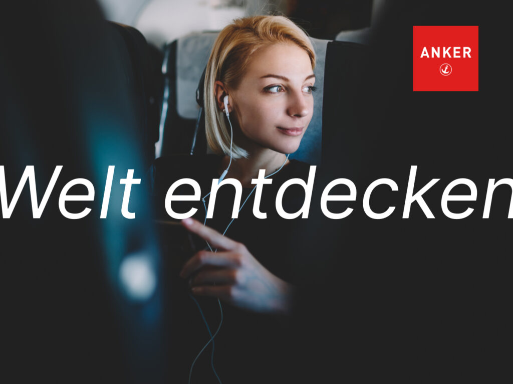
ANKER is a strong brand and has something to say. Statements and headlines are therefore placed „in your face“ with oversized type („BigTypo“) in the center of the image, so large that they even extend beyond the edges.
Images can be used full screen or full page. Body text is also positioned on top.